Led product design across the full purchase funnel for India's beauty unicorn — every decision tied to measurable outcomes at millions-of-users scale.
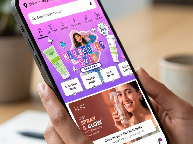
Purplle is a unicorn-valued beauty e-commerce platform serving millions of Indian consumers across makeup, skincare, and haircare. With 650+ brands and a massive Android-first user base, it competes at the highest level of consumer product design.
I joined as a designer, grew to Product Design Manager, and owned every major funnel the user touches — from homepage to order confirmation — for a decade.
Over 10 years I owned the core product end-to-end — the journeys every user passes through on every session.
The highest-stakes screen in e-commerce. Every element — imagery, hierarchy, reviews, add-to-cart placement — affects conversion directly. I redesigned around one principle: get the user to trust the product as fast as possible.
I audited every checkout step, identifying friction — redundant steps, poor error messaging, uncertain payment selection. Then simplified: fewer steps, inline error correction, progress indicators that reduced anxiety, and a payment screen designed to feel trustworthy and fast.
Purplle's login success rate was 10%. Nine in ten users who attempted to sign in were failing or giving up. I treated auth as a full product design problem — mapped drop-off points, identified dead ends, redesigned with clearer error states and a more forgiving flow.
India is not one market. I led a vernacular UX initiative — adapting the product for regional languages and designing for lower-literacy, lower-connectivity contexts. Visual-first navigation, simplified language, performance-conscious design, regional content priorities.
~20% daily loyalty program sign-up growth through engagement-driven UX redesign
~20% vernacular feature adoption, expanding reach in Tier-2 and Tier-3 markets
6% product discovery improvement from PDP content hierarchy restructure
Design Language System scaled across teams — improving UI consistency and dev handoff efficiency
A/B tests show which version wins. They don't explain why users behaved differently. The best hypotheses come before testing — not from hoping something sticks.
Authentication, error states, empty states — these are where most user trust is built or destroyed. The login redesign moved a needle nothing else had touched.
A design system isn't about beautiful components. It's about 5 designers working simultaneously shipping something that feels like one product.
Designing for Tier-2 and Tier-3 users taught me great UX is contextual, not universal. The designers who ignore this are designing for themselves.