A world-class neurologist with 17+ years of training and no digital presence to match. Built from scratch — Figma to live WordPress — for patients across India, the Middle East, and globally.
Dr. Chugh came with one clear ask: "I want to look credible globally." He had 17 years of elite training, six US board certifications, 278+ Google reviews, and appearances in the Economic Times — and a digital presence that matched none of it.
The site needed to work for a patient in Delhi on a slow connection, a diaspora family in the Middle East seeking a trusted neurologist, and a parent in Patna researching pediatric neurology — simultaneously. It also needed a working teleconsultation booking flow.
I don't build doctor websites the way most agencies do — start with a theme, fill in content, call it done. I started in Figma, mapping information architecture and user flows before designing a single screen.
Mapped the site structure around patient intent — not Dr. Chugh's credentials. What does a migraine patient find first vs. a parent researching pediatric ADHD?
Full visual system in Figma — typography, colour, components, all page layouts. Desktop and mobile. Every interaction state specified before opening WordPress.
Pixel-accurate implementation with a custom design skin — not a template. Optimised for performance on low-end Android and slow connections.
Tested across devices and connection speeds. Iterated on the teleconsultation page based on the real patient booking flow.
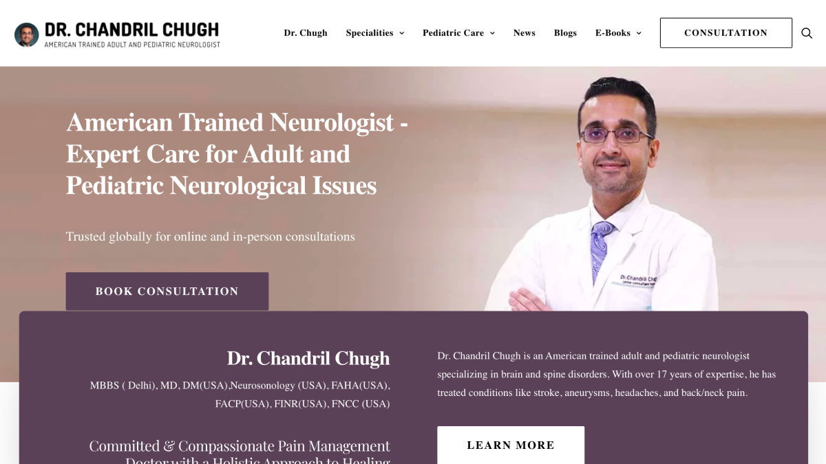
Dr. Chugh holds six US board certifications. The challenge: display this without turning the homepage into a medical CV patients can't parse. I designed a hierarchy of trust — the hero leads with outcome-focused copy, certifications appear as a compact badge strip, deeper credential detail lives on the profile page for patients who want to verify.
Patient reviews (278+ verified) were treated as a primary trust signal — not relegated to a footer widget. Real reviews in Hindi and English were placed prominently on the teleconsultation page, where anxious and hesitant patients need the most reassurance.
The teleconsultation page is where an anxious patient decides whether to book or leave. Most medical sites treat this as a generic "services" page. I designed it as a conversion page with a specific psychological flow:
Open with the patient's problem (not the service) → compressed credibility → address the unasked "is online consultation real?" → social proof from patients who've already consulted online → booking options. Three contact methods — WhatsApp, form, phone — given equal visual weight. No forced funnel.
Medical websites typically have one CTA: "Book Appointment." But patient behaviour is more varied — some want to ask a question first, some want to read more, some are ready to book immediately. Designing a single CTA for all of them means converting fewer of them.
I designed a persistent CTA strategy: a fixed WhatsApp button on every page (fastest path to human contact), a primary CTA in the hero for intent-ready visitors, and a soft secondary CTA for patients still in research mode. The homepage form was kept to three fields only — name, phone, problem — minimising abandonment from form fatigue.
"A doctor's website is not a brochure. It's the first consultation — the moment a patient decides whether they feel safe enough to reach out."
Global patient reach — India, Middle East, and international patients via teleconsultation
278+ verified Google reviews surfaced as a primary trust signal, not footer decoration
Media credibility (ET, TOI, Business Standard) integrated as recognisable borrowed authority
SEO-structured condition pages — every condition Dr. Chugh treats has a dedicated searchable page
E-book lead magnet for Essential Tremor — building an owned patient email audience
Performance-first WordPress build — fast load on budget Android devices and slow connections
A patient on a neurology site is not in the same headspace as someone browsing an e-commerce app. Fear and urgency change how people read, scroll, and decide. Design without accounting for this produces a technically correct site that doesn't convert.
The argument is: "This doctor will help me." The credentials support it. Leading with evidence before making the argument is a common mistake in professional services design — and why most medical sites feel cold and fail to build trust.
Booking a neurologist is not an impulse decision. Patients move at different speeds and through different channels. Designing for the full range of booking behaviours captures patients who would otherwise leave unconverted.
Full design in Figma before touching WordPress meant zero rework during development. Every layout decision, spacing choice, and component state was resolved before the first line of Elementor was placed.