01
Case Study 01 · SaaS · Community Tech · Fintech

Madina
Apps

Designing a unified platform for 750+ mosques across 450+ cities — five surfaces, one design system, millions in donations processed.

Product Design Lead SaaS · Community · Fintech Kiosk · Mobile · Web · TV · Admin Ongoing madinaapps.com ↗
750+
Mosques active
450+
Cities covered
1950+
Payment products
5
Surfaces designed
01 Background

An OS for the Masjid

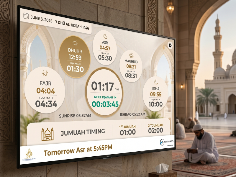
MadinaApps is a SaaS platform built specifically for mosques — helping them manage donations, run apps, display prayer times, handle school fees, and engage their communities across the US and globally.

Think of it as an all-in-one operating system for a masjid: one account, five surfaces, zero fragmentation — from a wall-mounted kiosk to a parent's phone to the TV screen behind the imam.

madinaapps
02 The Problem

5 tools. Zero consistency.

Before MadinaApps, mosque administrators juggled separate tools for donations, communications, events, and displays. No unified experience — for the admin or the community member.

The design challenge: create a coherent product experience across physically different surfaces for users with very different needs and technical comfort levels.

01
No unified design languageKiosk, web, and app each felt like a different product entirely
02
Donation flow frictionDrop-offs at the kiosk — the most critical conversion point
03
Admin portal too complexNon-technical volunteer staff couldn't operate it confidently
04
TV display had no hierarchyPrayer times, events, announcements all competing for space
05
Mobile missing engagementUsers opened the app once and never returned
03 My Approach

Design system first.
Screens second.

I started not with screens but with a design system — components and patterns that could adapt across a 6" phone, a 15" kiosk, and a 55" TV without losing coherence.

01

Understand the community

Spoke with mosque admins and donors. Mapped user journeys per surface. Found where friction caused abandonment.

02

Build the design system

Shared component library — typography, colour, spacing, interaction patterns — before any screen was designed.

03

Design for lowest friction

For each surface: what is the one thing a user needs to do here, and how fast can they do it?

04

Ship and iterate

750+ live mosques means patterns emerge at volume no prototype reveals. Design for flexibility from day one.

04 Design Decisions

What I designed
and why

Surface 01
Donation Kiosk

The kiosk is the most critical conversion surface — a donor walks up, taps, and either gives or leaves. I reduced the donation flow to 3 taps maximum. Large touch targets, high-contrast type, pre-set amounts with custom option, instant confirmation.

The Quick Tap Pay feature — a single-page, predefined-amount screen — was designed for Jumu'ah when queues form quickly. Speed was the entire design brief.

The kiosk has no room for confusion. Every pixel is a conversion decision.
Touch UIConversionAccessibilityHigh-stakes flow
Surface 02
Mobile App

Two distinct users: the casual member who checks prayer times, and the engaged member who donates, RSVPs, and reads announcements. I designed a layered information architecture — surface simplicity for the first, depth for the second.

IAOnboardingEngagement UXNotifications
Surface 03
TV Display

A unique surface — displayed on mosque TVs, viewed from across a room, no interaction. I created a modular layout system mosque admins configure from the web portal, with safe zones for prayer times, events, and announcements.

Display DesignContent HierarchyAdmin Config
Surface 04
Admin Portal

Mosque administrators are often volunteers. I simplified navigation to task-based sections (Donations, Events, Members, Display) rather than feature-based menus, reducing cognitive load significantly.

Admin UXComplex SystemsNon-technical Users
05 Results

750+ mosques.
450+ cities.

750+
Mosques signed up and active on the platform
1950+
Payment products deployed across locations
450+
Cities covered across the US and globally
$M+
Donation funding processed through the platform

Unified design system across 5 surfaces — maintaining consistency at every touchpoint

Kiosk donation flow reduced to 3 taps, cutting abandonment during high-traffic prayer times

Admin portal redesigned for volunteer staff — task-based navigation replacing feature menus

Quick Tap Pay launched as a new product for Friday prayer donation queues

06 Reflection

What this
taught me

01

Design system before screens

Building shared components upfront saved significant rework. When a kiosk, phone, and TV share the same tokens, consistency follows naturally.

02

Emotional stakes change design

A failed donation tap at a mosque during Friday prayer is embarrassing and trust-breaking. Designing for emotional context changes every edge case.

03

The admin is a user too

Mosque admins are often volunteers. Designing for their confidence was as important as designing for the donor.

04

Scale reveals design gaps

With 750+ active mosques, patterns emerge at volume that no prototype reveals. Design for flexibility from the start.

Previous
First project
Next
E-commerce · Beauty
Purplle — India's beauty unicorn
← Back to all work